How Product Labels Shifted from Handwritten Marks to Printed Designs
Product label history helps you read how packages identify contents, guide use and build recognition, with practical clues to notice on jars and tins.
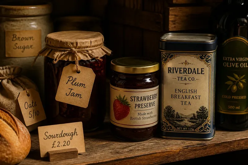
At a market stall, a jar may carry a handwritten card; nearby, a supermarket jar presents its name, ingredients and visual identity in print. Product label history is visible in that contrast, though it did not follow one uniform path. Labels have served different purposes in different settings, from identifying stored goods to helping unfamiliar buyers recognise and use a product.
Labels began with the need to tell things apart
In settings where goods were stored or sold locally, identification could take many forms: a handwritten tag, a mark on a container, or a note kept beside it. These examples are possibilities, not a claim that all communities used one method or changed at the same time. A name, contents note or maker’s mark could help someone distinguish one vessel or batch from another.
The same direct purpose remains familiar. Masking tape on a kitchen tin can identify its contents; a handwritten card beside a market loaf can name its type. In each case, the mark addresses a reader nearby who needs to sort, choose or handle the item.
When looking at a label, ask what it identifies. Does it name the contents, the maker, a place, or a storage category? The answer helps distinguish a mark made for local handling from one designed to accompany a product through sale and use.
Printing made repeated designs possible
Printing allows a maker to reproduce a label design across packages. That does not mean every producer adopted printing at once, or that handwritten marks disappeared. It means a repeated name, emblem or arrangement could be applied consistently when a producer chose to use that method.
A package sold beyond its place of production may meet readers who cannot ask its maker for an explanation. Its label can therefore bring the name, description and practical details together. The mix varies by product, place and period, so a label should be read as evidence of a particular design choice rather than proof of a universal historical sequence.
A printed label works a little like a noticeboard fixed to a container: it carries messages where a reader can find them. The package holds the product; the label can help a stranger identify it and understand how it is meant to be handled.
Read a product label by its visual hierarchy
Scan a package in stages. Start with the most prominent wording, then look for supporting information. Type size, placement, colour and borders all guide the order in which details attract attention.
- Find the product name. If it describes the contents plainly, use it to identify the item; if it is distinctive but unclear, look for a description before deciding what it is.
- Locate the maker or brand. If a name or emblem is visible, note who the package presents as its source; if none is clear, rely on the product description rather than guessing.
- Read practical details. If directions, contents or warnings appear, use them to guide handling; if information is missing or hard to read, check the package’s other panels or an appropriate source.
- Check the hierarchy. If a detail is prominent, note that the design gives it priority; if important wording is small or crowded, turn the package and inspect it before making a choice.
- Notice the material and attachment. If a paper label folds or rubs at an edge, account for that when reading it; if the surface is printed directly, look for the information on another panel as well.
Say you find an imagined bottle with a large fruit name, a small maker’s emblem and a compact block of storage directions. The starting point is a bottle whose contents and storage guidance both matter to its reader. First, read the fruit name to identify the product; next, check the emblem for the maker; then locate and read the storage block. The resulting answer is that the fruit name identifies the product first, while the separate directions tell the reader how to store it; if those directions are too cramped to read, the reader should inspect another panel rather than infer them from the design.
Design choices combine information and identity
A label has limited space, so its arrangement gives different jobs different levels of attention. The product name may be prominent, while directions or details sit in a quieter block. Look at what is easy to find and what takes more effort; this shows how the design balances recognition with practical use.
Visual identity can come from more than a logo. Repeated lettering, borders, illustrations and colours can make packages appear related. Images may suggest a flavour or use, but they do not replace words that identify the contents.
Compare two packages for the same broad kind of product. If one emphasises the maker’s name and another foregrounds a description or illustration, note which detail each design asks you to see first. Do not treat prominence as proof of quality or contents; use the descriptive wording and practical information to make those judgements.
What readers often ask about product label history?
Why might a maker print labels instead of writing them by hand?
Printing can reproduce a design consistently across packages, while handwriting can suit a small batch or a local task. The choice depends on the maker’s needs and context, not on a single universal change from one method to another.
What information can a product label carry?
A label may identify a product and maker, describe contents, or provide directions and other practical details. What it needs to state depends on the product and applicable rules; check the package and relevant local requirements where necessary.
How can I tell whether a label is mainly decorative?
Look for wording that identifies the product or explains its use, then distinguish it from illustrations and flourishes. Decoration can support recognition, but it should not be mistaken for a description of what is inside.
Read the label in relation to its container
The package surface affects where information can go. A curved jar, narrow box or broad tin presents different spaces for text and images. Seams, folds and transparent areas can also interrupt a reading path.
Notice whether the label is attached, wrapped around the container or printed directly on it. Look for rubbed edges, stains or wording that a hand might cover while holding the object. These clues connect visual design to handling and help explain why information may be placed on a particular panel.
Product label history is best read as a set of changing choices, not a simple tale of handwriting giving way everywhere to print. The marks on a package can identify, explain and create recognition, with different designs giving those tasks different weight. When you pick up a tin or bottle, read the prominent name, check the practical details and notice which parts of the surface make each task easier or harder.