The Matching Set Myth: Why Objects in a Room Need Not Look Alike
A matching set is not the only route to a coherent room. Use repeated colour, shape or material to connect unlike objects without making them identical.
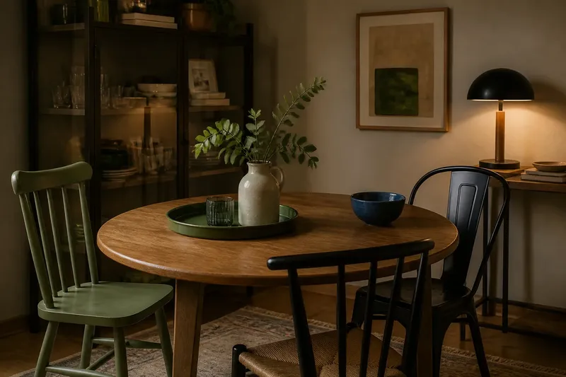
At the end of a small dining table, a blue ceramic bowl sits beside a pale wooden lamp and a black metal chair. None belongs to a matching set, yet the corner feels considered rather than collected at random. That is the useful lesson of the matching set myth: a room can feel coherent when objects share a few visual cues, even if their forms and origins differ.
Consider one invented situation. Say you have moved into a rented flat and inherited a round oak table, a narrow glass cabinet and two chairs that do not match. You also own a green enamel tray, a cream jug and a dark, low table lamp. Instead of replacing the chairs or buying a coordinated dining set, you decide to give the room a visual thread. The changes are small, but each has a clear purpose.
Start with the objects already in the room
Before choosing anything new, look at the objects that must stay. In this imagined flat, the oak table is the largest and most visible piece. The glass cabinet is tall and catches light; the chairs differ in shape, and one has a painted back. These are not problems to hide. They are the room’s starting conditions.
Make a quick inventory on paper. Note colour, outline and surface, rather than brand or set membership. The table has a warm, rounded outline and visible wood grain. The cabinet has straight edges and a reflective surface. The chairs have dark frames, while the painted back introduces a muted green. The green enamel tray repeats that colour in a smaller, movable object.
This kind of inventory helps distinguish a useful connection from a forced match. If every object is assessed only by whether it belongs to the same range, the room’s existing character disappears from view. A few shared cues give you a more flexible way to make decisions.
Choose one visual thread to repeat
For the invented room, choose muted green as the main colour thread. It already appears on one chair and the enamel tray, so there is no need to spread it across every surface. The cream jug can remain cream; its simple shape and light colour keep the arrangement from becoming too concentrated.
Colour is only one option. You could repeat a curved outline, as in a round mirror, a bowl and the back of a chair. Or you could repeat a material: several pieces with visible wood grain can sit together without sharing a finish or design. A room may also combine these cues, but one clear link is usually easier to read than a collection of unrelated echoes.
Think of the visual thread like a refrain in a song: it returns, but it does not turn every line into the same one. A green cushion, tray and small artwork can make a loose connection. Three identical green chairs may instead make the room feel arranged around a single purchase.
Use repetition at different scales
Repeated cues work best when they are not all the same size or placed in a row. In this imagined room, the green chair back is a large cue, the enamel tray is a medium one and a small green detail in a print could provide a quieter echo. The eye can recognise the colour across the space without meeting it as a rigid block.
Now place the objects with their use in mind. The tray can sit on the table because it holds cups or keys; the jug can serve as a vase on the cabinet; the lamp belongs where its light is useful. Their shared colour does not have to be the reason they occupy those positions. Practical placement keeps the room from looking like a display arranged only to prove a design point.
Leave some objects out of the pattern. The oak table’s grain, the glass cabinet and the black chair frame add contrast. Without those differences, the repeated green could become a colour scheme with no relief. Coherence depends on both connection and distinction.
Adjust the room without buying a set
In the hypothetical flat, the first arrangement still feels unsettled: the green chair is at one end of the table, while the tray and jug are grouped on the cabinet. The colour appears in two separate clusters. Move the tray to the table and place the jug on a different shelf, leaving space around both. Now the green is distributed through the room, and the cream jug acts as a pause between the darker pieces.
This is an adjustment, not a shopping problem. Try moving a small object before buying another one. A cushion can shift from a chair to a bench, a bowl can move from a shelf to a table, and artwork can be hung where its colour relates to furniture already in view. If the room still feels disconnected, add only an object that supplies a missing cue, such as a small piece with a rounded outline or a familiar material.
For a quick check, stand at the doorway and notice what catches your eye first. Then look for the repeated cue and ask whether it appears in more than one part of the room. If it dominates, remove or relocate one item. If it is hard to notice at all, shift an existing object into view before adding anything new.
Why can different furniture still look coordinated?
Do all the wood finishes need to match?
No. Wood pieces can sit together when another cue connects them, such as a similar warm tone, a shared rounded outline or repeated dark hardware. Keep enough contrast for the grain and finish to remain legible rather than treating every difference as a defect.
How many colours should repeat?
There is no fixed count to follow. Choose one colour already present and echo it in a few useful places, then judge the room from its usual entrance. If the colour overwhelms the furniture, reduce its presence instead of adding more matching accessories.
Can vintage and newer objects belong together?
Yes. A newer object can relate to an older one through shape, colour or material without imitating its age or construction. In the imagined flat, a plain contemporary lamp can sit beside the oak table because its dark base connects with the chair frames.
What if the room still feels cluttered?
Remove objects that have no practical role or visual connection, and leave open space around the pieces you want to keep. A coordinated room does not require an object on every surface; a quieter shelf can make the repeated cues easier to see.
Keep the result useful, not uniform
In this invented situation, the final room keeps the mismatched chairs, the oak table and the glass cabinet. The green tray, one chair back and a small detail in the artwork give the eye a path through the space. The lamp and jug retain their own shapes, and the wood and glass remain visibly different. The result feels connected because a few choices recur, not because every object has been replaced.
When deciding whether another item belongs, ask what it contributes: a colour already present, a shape that answers another shape, a useful material, or a practical function the room lacks. If it contributes nothing except a desire to complete a set, wait. The matching set myth loses its hold once you can see the room as relationships among objects, rather than a collection that must be bought all at once.